
First Time Writing! Font - CC0
A downloadable asset pack
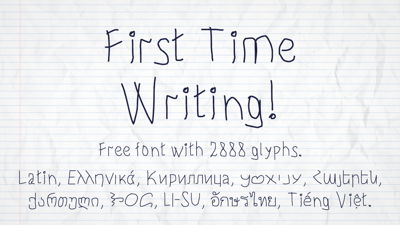
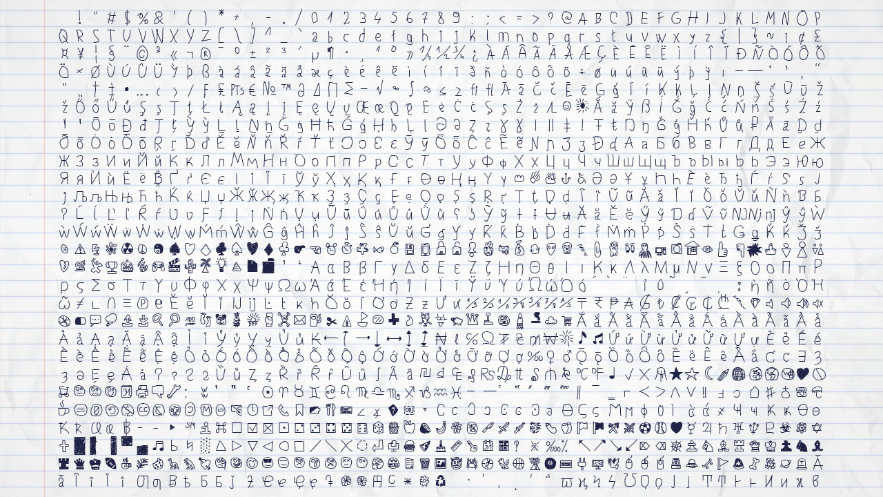
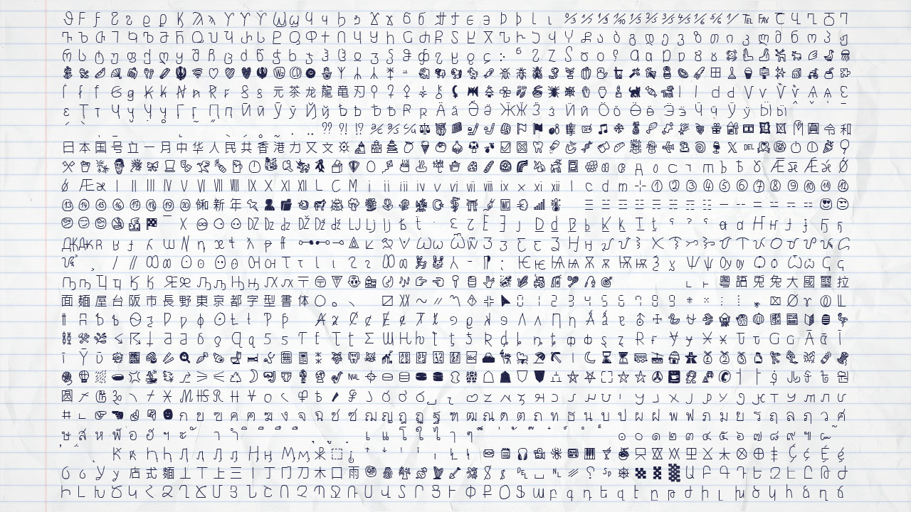
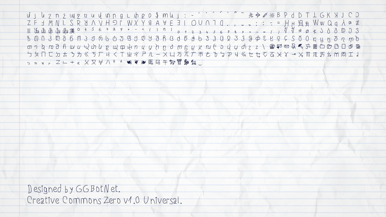
The font First Time Writing! contains 1 style and 2888 glyphs.
The very first basic handwrite style teaching at primary school.
Support for 103 languages
Aghem, Aja, Akan, Albanian, Armenian, Aromanian, Asturian, Azeri, Basaa, Bashkir, Belarusian, Breton, Bulgarian, Catalan, Central Yambasa, Chinese (Pinyin), Chuvash, Croatian, Czech, Dagbani, Danish, Dinka, Duala, Dutch, English, Esperanto, Estonian, Ewe, Ewondo, Finnish, Fon, French, Fula, Gagauz, Georgian, German, Greek, Guarani, Hausa, Hungarian, Icelandic, Igbo, Indonesian, Irish, Italian, Jula, Kabyle, Kako, Kazakh, Khoekhoe, Koyra Chiini, Koyraboro Senni, Kyrgyz, Lakota, Latin, Latvian, Lingala, Lithuanian, Livonian, Maasai, Macedonian, Maltese, Mapudungun, Marshallese, Mongolian, Mundang, Navajo, Ngiemboon, Ngomba, Northern Sami, Norwegian, Polish, Portuguese, Riffian, Romanian, Russian, Scottish Gaelic, Serbian, Serbian, Shawiya, Shilha, Skolt Sami, Slovak, Slovenian, Spanish, Swedish, Tagalog, Tatar, Tlapanec, Turkish, Turkmen, Ukrainian, Uzbek, Vai, Vietnamese, Walser German, Welsh, West Frisian, Yoruba, Zarma, Zazaki, Zulu.
License
This Font Software is licensed under the Creative Commons Zero v1.0 Universal.
This license is available with a FAQ at: https://creativecommons.org/publicdomain/zero/1.0/
Credits
Designed by GGBotNet
Update history
2025-12-07 - v1.40 / Added Unicode block: Georgian Extended, Georgian Supplement, Bopomofo, Bopomofo Extended. Additionally, several other glyphs.
Download
Click download now to get access to the following files:
Development log
- Version 1.37 - Armenian, FraserNov 18, 2025
- Version 1.35 - Thai, ElymaicSep 21, 2024
- Version 1.30Apr 15, 2024
- Version 1.25 - GeorgianSep 16, 2023
- Version 1.20Apr 26, 2023
- Version 1.10Mar 20, 2022
Comments
Log in with itch.io to leave a comment.
I recommend you to add "otf" tag
When first learning how to write, usually it's very difficult to have two identical characters look the exact same. I think this is the main issue with these kinds of fonts. If you look at two a's or any other character that appears a lot in text, it just won't seem right that it all looks the same each time, especially since the point is that it's trying to look out of the ordinary. An interesting way to fix this could be to have multiple variants of this font (at least for very common characters), which would basically be multiple attempts by the same 'preschooler' at writing the same character and then, depending on the use case, have some software automatically switch the font variant every time a character is used more than once. This could be a lot of work, but depending on how far you'd like to take it, it could make the font seem much more believable. But that's just my suggestion.
Thanks for the Feedback!
i really like it (do you want credit for it ?)
A credit is nice but not necessary.
ok thanks !
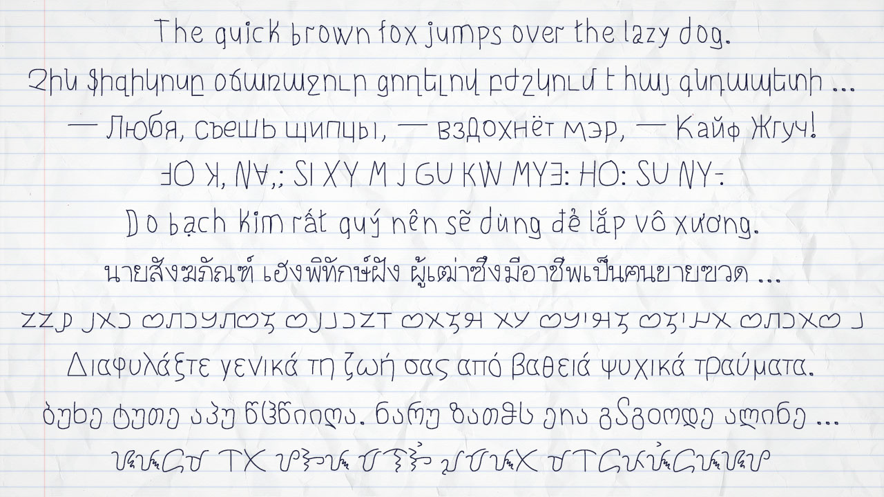
Why does it say "Generally safeguard your life from deep psychological trauma", in the Greek example?
It's a little weird, haha :P
PS: the iota (ι) in Greek does not have the tiny dot over it like the English "i", but good writing nonetheless.
Thanks for the iota, now I need to fix a few more fonts.
The text is a Greek pangram 146:https://backpacker.gr/pangrams/
How come your "first time writing" looks better than my regular writing >_>